TASK 10

Positives 

The module was very well laid out and structured very well, making the learning experience very enjoyable. 

The course material itself was also all very interesting and it was enjoyable to learn.


Negatives

It is difficult with the tasks to know how you are getting along without getting any feedback throughout the semester, however with such a large class number this is understandable, just unfortunate.

TASK 8

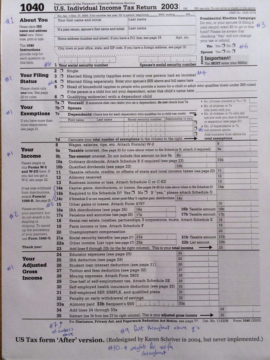
Task 8 describes what design techniques I used in the document design task for the module. This included;

  1. Typography sizes: Using the golden ratio scale, a size for each main heading, sub heading and also all the main body text was chosen. A legible font size of 12px was used for the main content, following this the main headings were set at a size of 19px as the golden ratio indicated an idea size of 19.41. Following this the sub-headings were given a slightly smaller size of 16px to allow for a clear visual heirarchy, ensuring the user does confuse sub-headings as a new heading.
  2. Font type: Times New Roman was chosen as the font-type, this is widely used in technical reports as the font-type and therefore this report will easily be recognized as a report by using it. It is clear, legible and has an important business-like status.
  3. Text width: each content paragraph is indented so that it is, on average, 66 characters wide, including spaces. This considers Bringhursts advice for the ideal width of a line.
  4. Lists: any lists given were clearly bullet-pointed so that the reader would group them together.
  5. Cover Page: Since it was a report, I added a front cover page that gave the title, date and where it was published.
  6. Header: The title of the report was added as the header throughout the report in the case it was opened on a random page by a reader.
  7. Footnotes: There was several citations throughout the report, these were added as footnotes in a smaller 10px font at the bottom the same page. They can be seen throughout.
  8. Graphs: Numerical data was graphed to allow for a more visual inspection, these included pie charts, when considering to values that add to 100%, also there was a clear difference between the two value which allowed for a clear easy to read pie chart. Scatter plots were also used to show how values changed on a year to year basis, showing the rises and falls.
  9. Tables: The numerical values used in graphs were also stored in tables for easier reading and comparison.
  10. Justification: the entire text was also justified for a cleaner, more business-like appearance.
  11. Table of contents: A usable table of contents was added, which can be used in the pdf.
  12. Page Numbers: Page numbers were added at the bottom of the page, for reader convienience, particularly using the table of contents for a printed version.
  13. Extra Note: The layout of some of the headings were altered, this included renaming subheadings, for example heading 2 was
    2. Austerity and the Traveller community

    Each subheading in that section was then added as 2.1, 2.2… etc. for example
    2.1 General features, 2008-2013
    2.2 Specific effects on the Traveller community
    It allows an easier to follow structure.


TASK 7

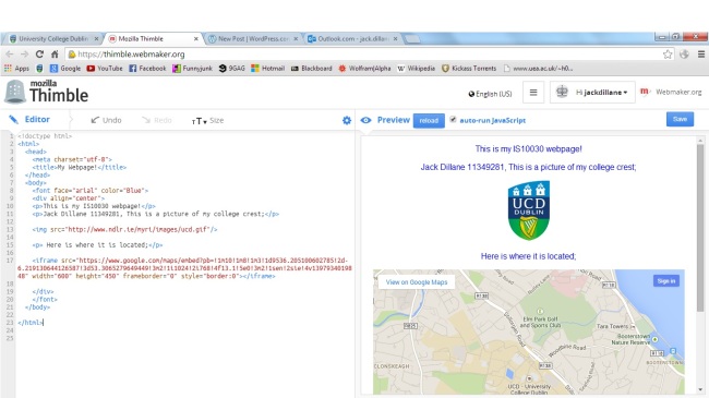
Task 7 involved making a Mozilla Thimble account, and publishing a new make.

The screenshot below shows my make;

Image

In this I edited the font so that it was arial, and blue. I added a picture of the UCD crest and embedded google maps showing where UCD is located, I also centre aligned all the content. 

TASK 6

Three properties of signs;

Picture 1: Iconic sign.

This is the sign for an escalator, an iconic sign is defined as an image that physically resembles what it “stands for” as can clearly be seen in the above image which depicts a man moving upwards on an escalator, in the direction of the arrow.


Picture 2: Symbolical sign.

These symbols represent male and female, clearly they have no physical resemblance to any male or female person, or animal, making them symbolic, they are images that we use to represent them. 


Picture 3: Indexical sign

An indexical sign is one that may the viewer may not directly resemble with the significant object, however it is directly connected in some way to that object. A fingerprint is an indexical sign in this way, fingerprints are unique and therefore represent an individual person, however by just looking at the fingerprint it is impossible to know which person it represents
 

Task 2

IBM-logoThe IBM logo is an excellent example of Gestalt, It uses the principle of closure. As can be seen, none of the letters are fully joined or completed, however the I, B & M can all be clearly distinguished.

The website I have chosen is the Apple Ireland home page, The large central promotional image immediately draws your attention, and from there to the other 4 bottom promotional images. It manipulates the users preattention, determining the route they will take while looking through the page.

link: http://www.apple.com/